Consumers Are Rewriting the Shelf
In 2026, packaging and branding trends are not being dictated by designers. They are being dictated by consumer behavior.
Shoppers are moving faster. Attention spans are shorter. Price sensitivity is higher. Category clutter is heavier. Consumers are not browsing for beauty. They are scanning for clarity, confidence, and cues they trust.
Across coverage in The Drum, The Dieline, Communication Arts, and Branding Mag, one pattern is clear. The brands gaining traction are those responding to emotional and behavioral truths, not aesthetic cycles.
Here is what consumers are responding to right now.
Consumers are overwhelmed
Shoppers face more SKUs, claims, and functional promises than ever. As a result, shelf environments feel increasingly difficult to navigate.
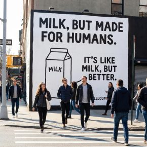
The Dieline and Communication Arts have both highlighted a rise in minimalist systems, but the driver is not trend fatigue. It is cognitive fatigue.
Consumers are choosing brands that:
Communicate in seconds
Prioritize legibility
Use disciplined typography
Remove unnecessary messaging layers
Minimal packaging signals product confidence. When a label does less, shoppers infer there is less to hide.
In wine and spirits, simplified labels communicate approachability. Meanwhile, better-for-you products use them to signal ingredient transparency. Pet health brands also benefit because simpler designs feel more human.
Consumers do not want to decode packaging. They want to understand it immediately.

Heritage That Feels Current, Not Stuck
Branding Mag and The Drum continue to document a return to legacy codes. But consumers are not nostalgic for the past. They are looking for brands that feel grounded.
There is a difference.
Shoppers respond to:
Updated wordmarks that retain equity
Strong silhouettes
Simplified crests and emblems
Clear varietal or flavor coding
Confident color systems
What they reject:
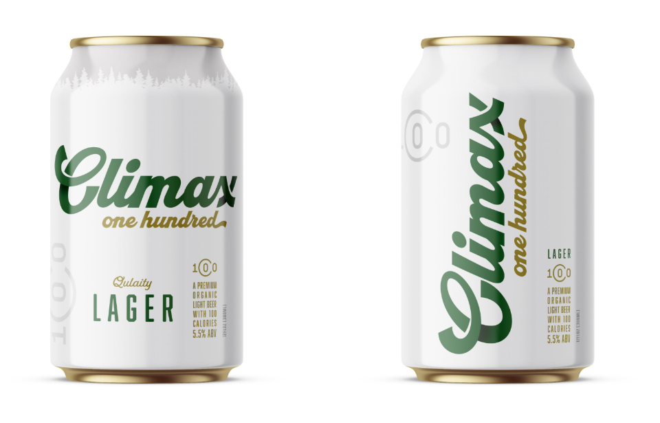
Ornate scripts that feel dated
Visual clutter
Inconsistent brand architecture
Designs that feel frozen in the 90s
Younger consumers want credibility. Older consumers want familiarity. The brands gaining share are those that bridge both.
Heritage earns trust. Modern execution earns relevance.
Human Texture in a Polished World
As digital content becomes increasingly automated, human detail carries more weight.
The Dieline has featured a growing number of hand-rendered packaging systems. Communication Arts continues to reward illustration-driven brand worlds. The common thread is craft.
Consumers are gravitating toward:
Fine-line botanical drawings
Organic textures
Subtle imperfections
Visible artistry
These elements signal:
Care
Small-batch thinking
Authenticity
Sustainability alignment
In beverage alcohol, illustration can soften price resistance. Meanwhile, plant-based brands use it to reinforce ethical positioning. Wellness brands also rely on illustration to make clinical benefits feel personal.
Consumers are not looking for hyper-polished perfection. They are looking for evidence that humans were involved.

Bold Color That Reduces Decision Friction
Retail environments are visually chaotic. Consumers navigate by pattern recognition.
The Drum has emphasized retail experience design as a critical differentiator. Bold color is one of the most effective navigational tools available.
Consumers respond to:
Strong varietal color coding
High-contrast palettes
Consistent brand color ownership
Clear visual segmentation
Color reduces decision time. It creates familiarity across visits. It increases recall in digital environments where products appear as thumbnails.
In crowded categories like RTDs, energy drinks, and wine, decisive color systems outperform neutral palettes that blend into the shelf.
Shoppers want to find what they like quickly. Color is a shortcut.

Sustainability That Feels Real
Consumers have matured past sustainability claims. They are evaluating consistency.
Branding Mag has highlighted the shift from sustainability messaging to sustainability execution. The Drum’s reporting reflects growing skepticism toward greenwashing.
Shoppers are responding to:
Reduced material use
Lighter bottles
Clear recycling communication
Minimal ink coverage
Transparent sourcing narratives
What they are not responding to:
Overused green badges
Vague claims
Decorative eco iconography without proof
In 2026, sustainability must show up in structure, not just language. Consumers reward brands that integrate environmental responsibility into the physical object itself.
Cohesive Brand Systems Across Physical and Digital
Consumers no longer separate shelf and screen. They encounter brands in search results, retail aisles, social feeds, and product detail pages in the same day.
What they respond to:
Consistent naming systems
Clear hierarchy
Recognizable iconography
Visual continuity across formats
Packaging that reads well at small scale
When brand architecture is fractured, trust erodes. When systems are tight, confidence increases.
Consumers equate consistency with competence.
Why These Packaging and Branding Trends Matter
Shoppers are not consciously evaluating typography or design grids. They are making split-second judgments based on signals.
They are asking:
Does this feel trustworthy?
Is this easy to understand?
Does this align with my values?
Does this feel current?
Does this simplify my choice?
Packaging and branding trends 2026 are simply expressions of those questions.
Minimalism answers clarity.
Heritage answers trust.
Illustration answers authenticity.
Color answers navigation.
Sustainability answers integrity.
Systems answer confidence.
When brands align with these signals, they reduce friction. Reduced friction increases conversion. Increased conversion drives growth.
Frequently Asked Questions
What Are the Main Packaging and Branding Trends for 2026?
The leading packaging and branding trends for 2026 include greater clarity, modern heritage design, human illustration, bold color systems, credible sustainability, and consistency across physical and digital touchpoints.
Why Is Packaging Clarity Important in 2026?
Consumers face crowded shelves, competing claims, and limited decision time. Clear hierarchy, readable typography, and focused messaging help shoppers understand products quickly and purchase with greater confidence.
How Does Packaging Influence Retail Performance?
Packaging improves retail performance by increasing recognition, communicating value, and reducing decision friction. Strong packaging also helps products remain identifiable on shelves, retailer websites, and small mobile screens.
Is Minimalist Packaging Still Effective?
Minimalist packaging remains effective when it improves understanding rather than simply following an aesthetic trend. It can communicate confidence, transparency, and approachability when supported by clear brand positioning.