How Eel River Brewing Used Brand Equity to Launch a National Better-For-You Beverage
Breaking into the booming better-for-you beverage space requires more than a good idea—it takes clarity.
For Eel River Brewing, the country’s first 100% certified organic brewery, the insight was simple: not every customer wanted a beer. In fact, a growing number of consumers—particularly younger ones—were reaching for cleaner, lighter, and lower-calorie alcoholic options. The team at Agency Squid helped translate that white space into a brand that’s now making a national impact.
The Opportunity: Responding to Evolving Consumer Preferences
While Eel River had built a strong reputation for its organic microbrews in Northern California and Southern Oregon. It recognized a shift in consumer behavior at its on-premise locations. Many visitors were asking for something other than beer. Something that felt healthier, more functional, and aligned with a wellness-forward lifestyle.
Agency Squid helped the brand respond to that demand by launching Clarity Hard Sparkling Water, a clean-label alcoholic beverage made with just three natural ingredients: water, alcohol (5% ABV), and real fruit flavor. With under 100 calories per serving and no artificial additives, Clarity was built from the ground up to appeal to health-conscious millennial drinkers seeking better-for-you alternatives in the alcohol aisle.
Turning Brand Equity into a Launchpad
Too often, new product lines in the CPG space are introduced without tapping into the equity and authority of the parent brand. For Clarity, we did the opposite.
As Eel River’s creative and strategic partner, Agency Squid worked to extend the master brand’s credibility into a new category—using its legacy in organic brewing as a foundational differentiator in a crowded hard seltzer and RTD marketplace.
From positioning to naming, packaging to messaging, we treated every touchpoint as an opportunity to signal transparency, simplicity, and quality.
Strategic Brand Identity & Design System
Naming & Tagline: The name “Clarity” reflected the brand’s purity of ingredients and intention. Paired with the rallying cry “Every Drop Matters™,” the brand reinforced its commitment to transparency and mindful consumption.
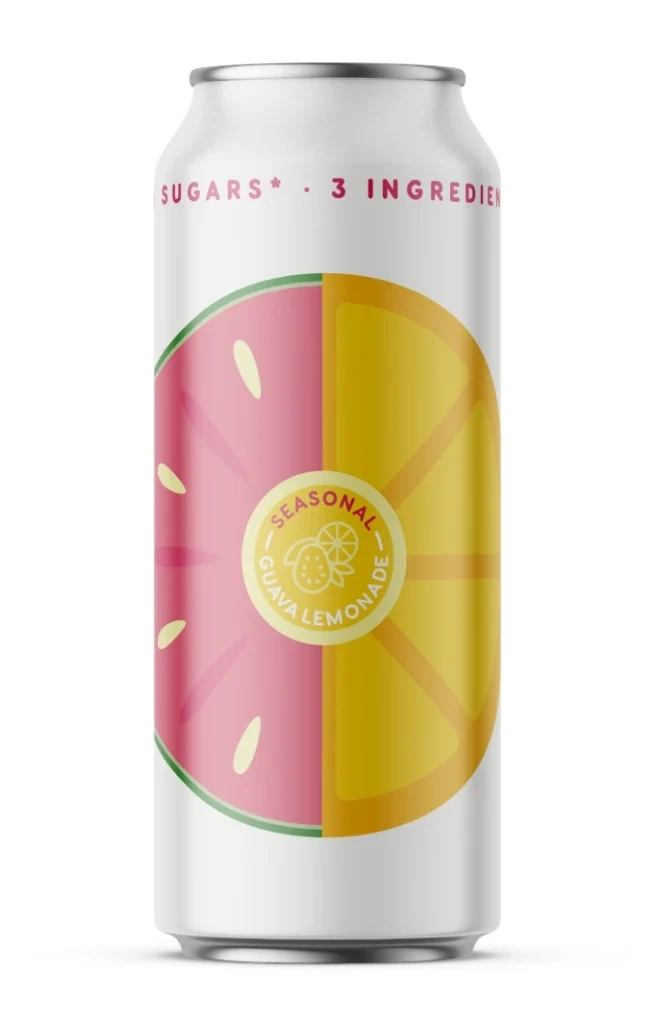
Packaging Design: Gender-neutral, clean, and confident. We developed a packaging system that featured minimalist design, clear flavor callouts, and a color-forward visual identity to maximize shelf blocking and stand out in the sparkling alcohol segment.
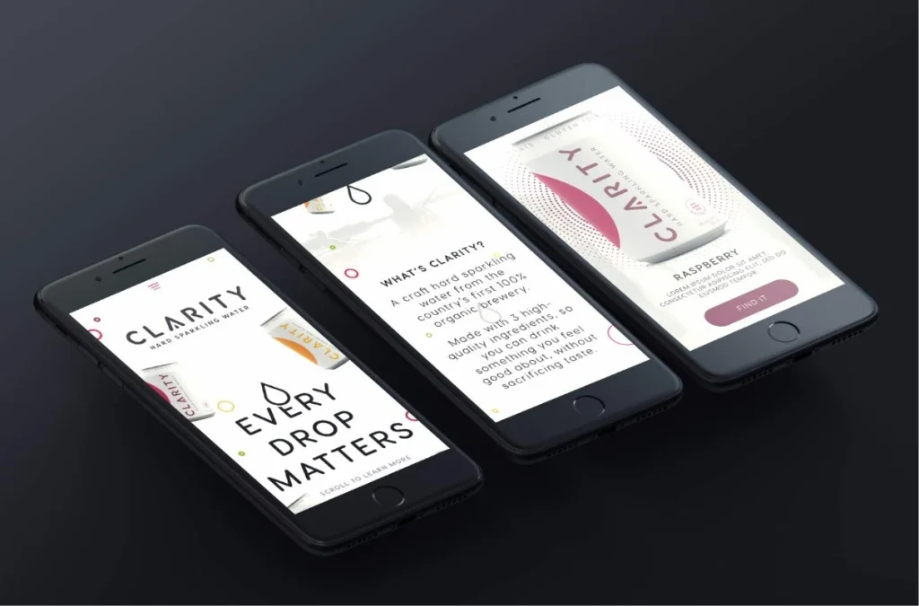
Mobile-First Digital Experience: Knowing the target audience skewed millennial and mobile, we built a sleek, responsive website designed for discovery, trial, and conversion at the point of purchase—both in-store and on the go.
Sales Enablement & Go-To-Market Strategy
To support Clarity’s B2B and B2C rollout, Agency Squid developed a suite of distributor- and retailer-ready sales materials. The materials emphasized Eel River’s organic credentials, the simplicity of the ingredient deck, and early signs of consumer loyalty. Lifestyle photography, styled in ghosted black and white, was paired with bold product imagery to keep attention where it mattered most—on Clarity.
The Results: From Local Innovation to National Expansion
What started as a local test market win quickly evolved into a scalable growth story. Clarity Hard Sparkling Water gained traction with natural and independent retailers before being picked up by larger national chains. The brand is now helping Eel River reach new consumers beyond the beer-drinking audience—establishing a foothold in the fast-growing low-calorie, low-sugar alcohol segment.
Services Delivered by Agency Squid
Brand Strategy & Consulting
Product Naming & Positioning
Visual Identity & Packaging Design
Website Design & Development
Advertising & Marketing Materials
Sales Enablement Toolkits