Driving National Attention for Organic Craft Beer Through Bold Packaging and Seasonal Brand Systems
Bringing New Life to Eel River Brewing Through Seasonals & Product Extensions
Agency Squid partnered with Eel River Brewing to elevate its most visible products on shelf and in market—most notably the Earth Thirst Organic Double IPA and the brewery’s attention-grabbing Climax 100 line—using packaging and seasonal systems designed to drive trial, spark conversation, and earn national attention.
The work focused on one core challenge facing craft beer marketers today: how to stand out in a saturated IPA and seasonal beer landscape while remaining authentic, compliant, and commercially effective. The result was a series of bold, modern labels that reinforced Eel River Brewing’s leadership in organic brewing while positioning its seasonals as must-try, limited releases.
The Challenge
Eel River Brewing has long been a pioneer in organic beer, but by the early 2020s the competitive context had changed:
Craft beer shelves were more crowded than ever
Seasonal beers needed immediate visual impact to justify limited runs
Organic credentials risked feeling muted or overly traditional
Retail buyers and consumers alike demanded clearer differentiation
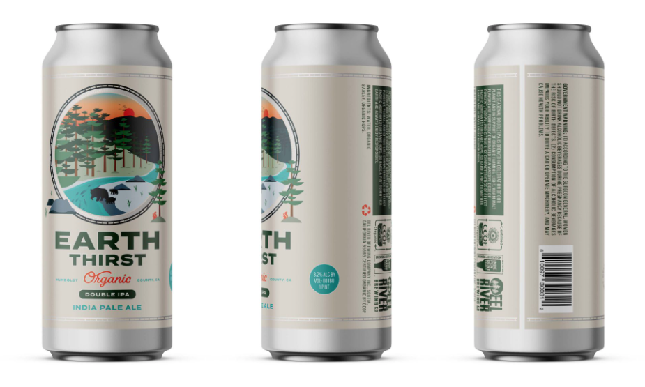
Earth Thirst Organic Double IPA, brewed annually in honor of Earth Day, carried over a decade of equity—but its previous packaging leaned heavily on dark tones and familiar redwood imagery. At the same time, Climax 100 and other seasonals were gaining attention for their bold personalities, proving there was appetite for more expressive, shelf-disruptive design.
The mandate was clear:
Create a packaging system that could honor legacy, signal organic credibility, and compete visually with the most aggressive craft brands in the country—without sacrificing compliance or brand integrity.
Strategic Insight: Craft Beer Drinkers Do Not Separate Product From Experience
In the beverage alcohol space, packaging is not decoration—it is the first and most influential brand touchpoint.
Our research surfaced three truths critical for craft and organic beer brands:
Seasonal buyers expect visual excitement and collectability
Organic cues must feel confident and modern, not restrained
Shelf impact directly influences trial in crowded IPA segments
For Eel River Brewing, the opportunity was to treat Earth Thirst and Climax 100 not as isolated SKUs, but as brand moments—each with a distinct personality tied back to the brewery’s organic ethos.
The Work
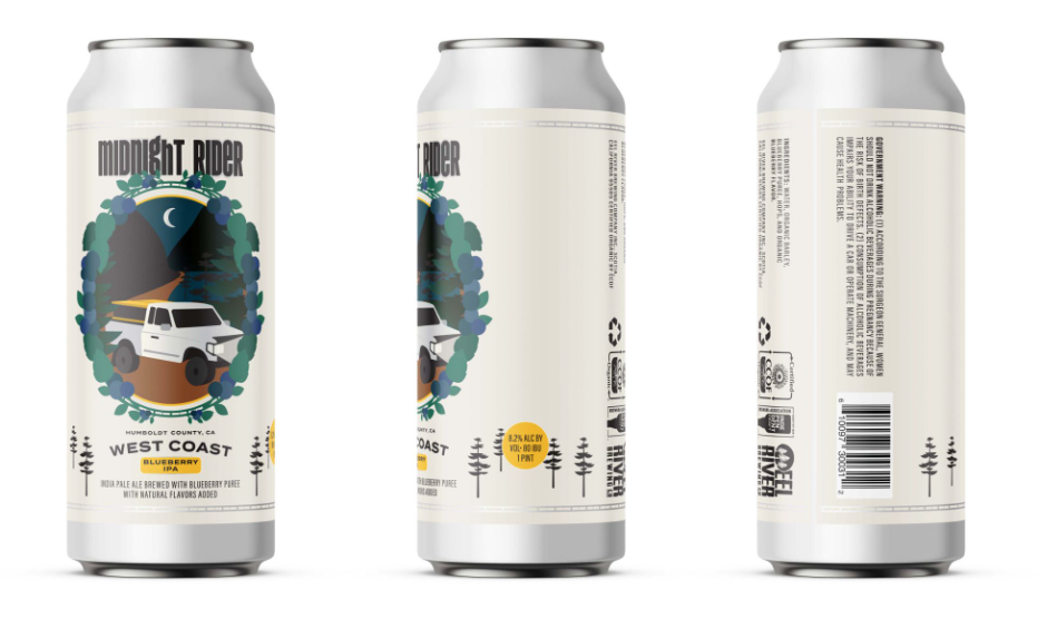
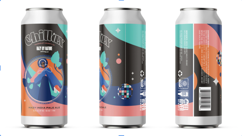
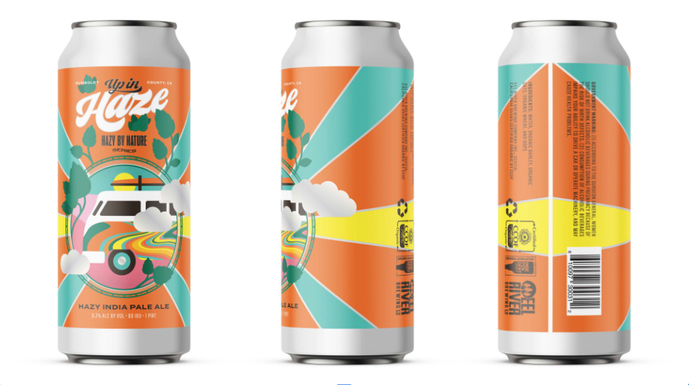
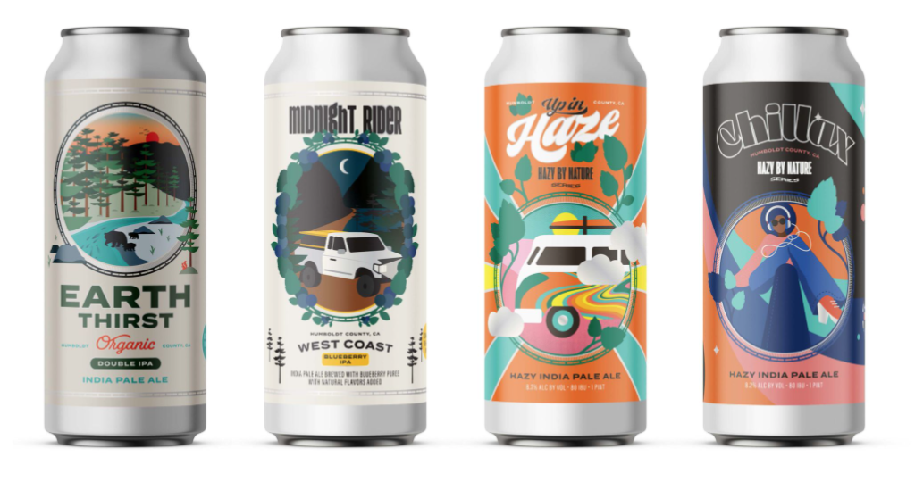
Packaging Redesign: Earth Thirst, Midnight Rider, Hazy By Nature, and Up In Haze
Agency Squid reimagined the series with a bright, modern, and premium visual language that broke from category clichés while reinforcing organic integrity.
Design Approach
Vibrant greens and layered textures to signal freshness and ecological vitality
Metallic accents to elevate perceived quality and shelf presence
Coastal and environmental references without relying on globes or literal Earth Day symbolism
Clear hierarchy for beer style, USDA organic credentials, and flavor notes
The updated label celebrated experimentation in organic brewing while giving the beer renewed relevance for contemporary craft drinkers.
The Work
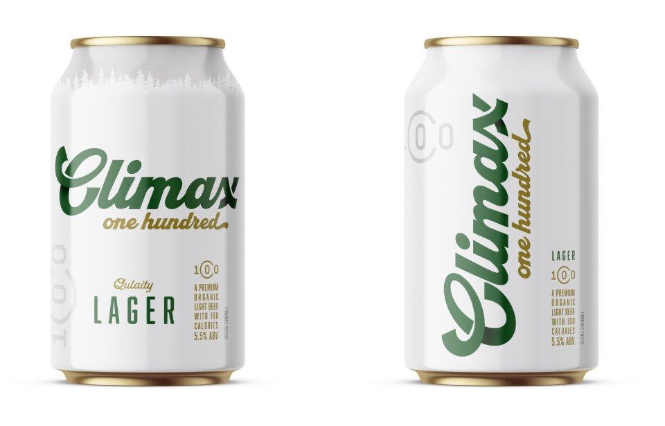
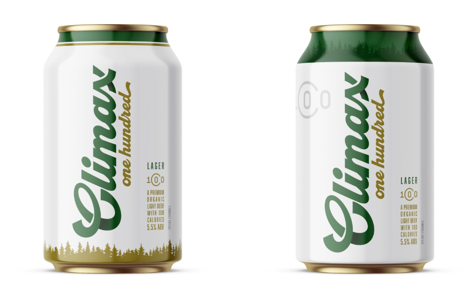
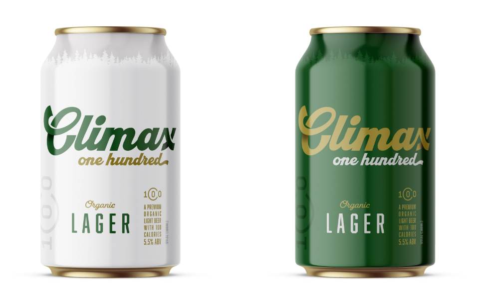
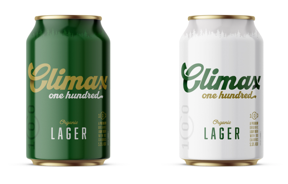
Brand Development: Climax 100 Light Organic Beer
Building on the momentum of Earth Thirst, Squid helped establish a broader seasonal framework that allowed beers like Climax 100 to command attention through confidence and clarity.
Bold typography and assertive naming systems
Flexible design architecture adaptable to future seasonals
Visual consistency that supported retail recognition without repetition
Compliance-ready execution for national distribution
Together, these systems gave Eel River Brewing the ability to move faster, test bolder ideas, and show up competitively against much larger craft portfolios.

Results
Immediate Impact
Award-winning packaging that revitalized a decade-old seasonal
Increased shelf standout in highly competitive IPA sets
Strong consumer response driven by visual differentiation
Brand & Business Impact
Reinforced Eel River Brewing’s position as a leader in organic craft beer
Elevated national perception through seasonals that felt intentional and collectible
Enabled new and existing drinkers to re-engage with the brand
Long-Term Value
A scalable seasonal label system adaptable to future releases
Consistent balance of organic credibility and modern craft aesthetics
Packaging that continues to work as a sales and storytelling tool across channels
Frequently Asked Questions
What Was the Goal of the Eel River Brewing Packaging Project?
The Eel River Brewing packaging project aimed to increase shelf impact, modernize its organic credentials, and attract national attention. The system also needed to preserve the brewery’s established identity while supporting seasonal product releases.
How Did Agency Squid Redesign Eel River Brewing Packaging?
Agency Squid introduced vibrant colors, layered textures, metallic accents, and clearer information hierarchy. The designs communicated organic credibility while creating a more modern and competitive presence on crowded craft beer shelves.
Which Eel River Brewing Products Received New Packaging?
The work included Earth Thirst Organic Double IPA, Midnight Rider, Hazy By Nature, Up In Haze, and Climax 100 Light Organic Beer. Each product received a distinct design connected to a consistent seasonal brand system.
Why Is Packaging Important for Organic Craft Beer?
Packaging communicates beer style, quality, flavor, and organic credentials before purchase. A clear and distinctive design helps organic craft beer compete for attention, build recognition, and encourage trial in crowded retail environments.